|
Hånden
er fra
danseforestillingen
«Joystick» med Demodans,
SubGud, og H.C. Gilje .
Foto/3D-illustrasjon: Observatoriet v/Jan Alsaker,
Design : Aina Griffin.
|

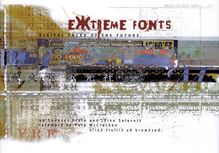
EXTREME FONTS
Digital Faces of The Future
For
de som tror at verden har sett nok av halvinteressante coffee-table-typografibøker
kan denne spalte anbefale boken Extreme Fonts, Digital Faces
of The Future som er nylig utgitt på Madison Square Press
i New York. Boken er kompilert av Spencer Drate og Jütka
Salavetz. Drate er en gammel ringrev som er kjent for bl.a.
CD-omslag til Bon Jovi, Lou Reed, U2, The Ramones, The Velvet
Underground, Joan Jett og Talking Heads. Teamet har også
stått bak andre bøker som Cool Type I og Cool Type
II.
Boken viser at ekspressiv typografi likevel ikke er helt død
og utslitt på tampen av dette tiåret. Hele alfabeter
vises sammen med eksempler på anvendelse på en ryddig
og veldesignet måte av Theres
Wegman. Wegmans website viser forøvrig en uvanlig
god beherskelse av jobbing i alle designmedier. I Extreme Fonts
finnes arbeider fra bl.a. Plazm, Pablo A. Medina, Fontboy.com,
Darren Scott, Elliot Earls, Psy/Ops, T-26, Thirstype, Geoff
Kaplan, Chank, Marcus Burlile, Dirk Uhlenbrock, Prototype, Acme
Fonts, samt 5 nordmenn.
The amount of typejunk thatís being
generated all over the world is overwhelming. Advancements in
technology in the last two decades have glorified a field that
by itís very nature should put anybody to sleep sitting around
discussing it at dinner. Has this caused the industry to think
it can master every artistic field with a wave of a magic hand?
What bugs me most these days are not the type-enthusiasts, the
type-wannebes, the typegeeks, or stereotypes ó itís the pedantic
type-mavens that are sitting around self-amusing themselves
with home movies theyíre meticulously splicing together with
pseudo-intellectual friends and then calling their self-indulgent
shit art. [Please keep the hobbies in the garage or go back
to school.] The divided attention within our discipline is caused
by the accelerated speed of our lives overloading our ability
to tackle just one problem with a clear mind. We are catapulting
ourselves into the Future, desperately trying to do more in
one day then we should, or could desperately do a decade ago.
The work overall within the industry suffers.
Pete McCracken (fra introen til boken «Extreme Fonts»)
Typography? You cats floor me. Once
again focusing on the wrong damn thing.. Listen, The life, like
some grand king of the roller derby, should lord over the manifestation
of all forms of our expression. Let the life lived give rise
to this shit. You canít buy it in a can, and you wonít find
it between the sheets of no book. Did species nautilus find
the blueprints for hi s waxy armor in the bible? [Look, that
corlscrew shell werenít no act of plagiarism, dig?] That mollusk
had no choice. Nobody held a gun to his tiny head, he grew that
shit from the depths of his soul and from the syncopated rhythm
of his DNA. Canít say it more plainly. All this voodoo be nothiní
but doo-doo, without a natural original-gangster-mac-daddy growth
scheme.
I think the issue examined from the perspective of «Typography»
is completely inane. Look in the mirror. See that mass of hair
)or lack thereof) plastered to your head? Thatís typography.
Yea, you can cut it, dye it, flop it, weave it, but all the
mouse in the world ainít going to get you no Panteneô endorsement
deal, cause you ainít no Selma Heyakô. The point? The point
would be donít let your left hand know what the hell your right
hand is doing. Live that shit. Breathe that shit, and let your
ideas manifest themselves like some big-assed sea turtle laying
mad eggs. A sea turtle rutting, grunting and kicking sand. Reject
that flunky homo sapien simu-lectual posturing. Reject that
austalopithecus man proto hunchback art brute shit. Be natural
like little flowers growing wild in a summer field. be natural,
stupid like moss or skunks are stupid, dig? If we must discuss
«type», letís discuss it like the crows living high
above our heads in the canopy. High above our earthbound feet,
our un-feathered lives.
Elliot Peter Earls fra hans «backword» i Extreme
Fonts
Elliot Earls er klin gæren og genial. Hans CD-ROM prosjekter
og plakater etc. er obligatorisk for alle som trenger et kreativt
kick i ræva. Sjekk www.theapolloprogram.com
eller www.emigre.com.
En annen typobok som kan sjekkes ut er Emotional Digital,
som er en innholdsrik bok med noen nye ting, f.eks. en interessant
russisk typefoundry.
|